
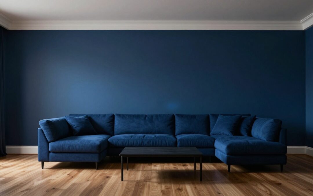
Wall Color, Trim & Floors: Best Matching Tips 2026
When it comes to Interior Painting Raleigh projects, paint looks simple until the walls, trim, and floors all start competing for attention. The process of professional interior house painting can feel overwhelming when a color that seemed clean on a tiny chip turns yellow beside bright white trim, or cold next to warm oak floors.
You don’t need a designer’s eye to get it right. Once you know how to read undertones, decide which surface should lead, and test samples in your own light, matching wall color with trim and floors gets much easier.
Key Takeaways
- Start with the undertones in your floors and trim, because those fixed surfaces shape every wall color around them.
- White trim gives you more freedom for contrast, while natural wood trim usually looks better with warmer, softer wall colors.
- Light floors can handle white, greige, beige, or gray more easily; dark floors need careful balance so the room does not feel heavy.
- Complementary colors create a calm, connected look, while contrast works best when it feels intentional, not accidental.
- Large samples on the wall, viewed throughout the day, beat paint chips every time, though consulting with professional house painters is recommended if you want expert color matching for complex spaces.
Start With the Undertones You Already Have
Before you choose a wall color, figure out what you already own. Floors and trim are the expensive, hard-to-change parts of the room, so they usually get the first vote.
The easiest way to spot an undertone is to hold a plain sheet of white paper next to the floor or trim. If the surface starts to look yellow, red, orange, or creamy, it is warm. If it reads gray, taupe, ash, or slightly blue, it is cool. Some floors land close to neutral, but even neutral paint colors lean a little one way or the other. If you find it difficult to distinguish these subtle shades, scheduling a professional color consultation can help you accurately identify undertones before you buy paint.
White trim needs a closer look too. Not all white paint is the same. Some whites are crisp and bright, like Sherwin-Williams Pure White or Benjamin Moore Chantilly Lace. Others are softer and creamier, like Sherwin-Williams Alabaster or Benjamin Moore White Dove.

Photo by cottonbro studio
If you want to compare real palette directions, Sherwin-Williams offers designer-curated paint colors for wood floors that show how the same wall family can shift depending on the wood tone.
A quick reference point can help:
| Floor or trim look | Likely undertone | Wall colors that usually work |
|---|---|---|
| Honey oak, orange oak, cherry, creamy white trim | Warm | Warm white, beige, soft greige, muted green |
| White oak, taupe tile, off-white trim | Neutral-warm | Greige, mushroom, soft white, light beige |
| Ash wood, gray-brown floors, bright crisp white trim | Cool | Clean white, cool gray, blue-gray, cool greige |
The goal is not to match everything exactly. The goal is to make the room feel connected. When the undertones agree, even different colors can look polished and intentional.
Match the Walls to Your Trim Style
Trim frames the room. It outlines doors, windows, baseboards, and crown, so it has a big effect on how your wall color reads. If you are planning on refreshing your space, professional house painters can help you navigate these subtle color transitions to ensure a high-quality finish.
If you have white trim
White trim is flexible, but it still has a personality. Crisp white trim looks sharp beside cooler wall colors, soft grays, pale blue-grays, and balanced greiges. Creamy white trim usually pairs better with warmer whites, beiges, and softer earth-based neutrals. If your project includes cabinet painting, be sure to coordinate those colors with your trim to ensure a cohesive look throughout your home.
If you want a quiet, clean look, keep the wall color in the same temperature family as the trim. A warm white wall beside a warm white trim feels soft and layered. A cooler white wall beside bright trim feels fresh and tailored.
If you want more contrast, white trim can handle it. Deep greige, muted green, navy, and charcoal all look more finished when they meet a clear white baseboard and casing. That is one reason white trim is so common, as it gives the room a clean edge.
Gray deserves a little caution here. It can look beautiful with white trim and cool floors. It can also feel flat beside warm wood or creamy trim. If the room already leans warm, a gray that has some beige in it usually works better than a strict, steely gray.
If you have natural wood trim
Natural wood trim asks for a different approach. It brings color, grain, and warmth into the room, so the walls need to support it instead of fighting it. Because wood surfaces require specific prep work, expert trim painting is often recommended to achieve a polished result that highlights the natural grain.
Warm whites, soft beige, mushroom, muted olive, and warm greige are often the safest choices. These colors let the wood look rich and settled. Cooler grays can make orange oak or reddish wood feel more obvious, and not in a good way.
Dark-stained wood is a little more forgiving. Walnut or espresso trim can look strong with creamy white walls, warm taupe, or even a moody color if the room has enough light. Lighter oak trim usually looks best with softer, lighter wall colors.
If your trim and floors don’t match perfectly, let the larger and less changeable surface lead, which is usually the floor.
That one rule clears up a lot of indecision. If the trim is painted, it can be updated later. If the flooring stays, build the wall color around it first.
Adjust for Light Floors, Dark Floors, and Contrast
Floor depth changes the whole balance of a room. Light floors reflect more light and feel open, while dark floors ground the room and add weight. When you are planning your interior house painting, your wall color should answer that weight, not ignore it. As you calculate your budget, keep in mind that the total cost per square foot for your project often includes these material updates, so choosing wall colors that complement your existing floors helps you maximize your investment.
Working with light flooring
Light oak, maple, pale tile, and natural white oak give you the most flexibility. Warm white walls keep the room airy. Greige adds softness without making things feel beige. Beige works well when the floor has golden or honey notes. Gray can work too, but it looks best when the floor has an ashy or cooler cast and the trim is a cleaner white.
If your room feels washed out, add gentle contrast instead of a stronger color. A mid-tone greige, a light taupe, or a soft sage usually creates enough separation to define the walls without breaking the room apart.
A few pairings that often work well are light oak with White Dove, white oak with Pale Oak, and blonde wood with Accessible Beige. None of these are one-size-fits-all answers, but they show how soft, balanced colors can keep light floors looking natural.
Working with dark flooring
Dark floors need a little more care, because they can make the room feel rich and cozy or heavy and closed in. White walls create the strongest contrast, and that contrast can look crisp, classic, and expensive when the trim is also white.
Greige is a strong middle ground with dark floors. It softens the contrast, keeps the room bright, and still feels clean. Beige is often the better choice when dark flooring has red, chocolate, or warm brown undertones. Gray usually works best when the floor has a cooler espresso or charcoal cast.
For inspiration, this collection of hardwood floor and wall color pairings is useful for comparing warm and cool combinations in real rooms.
There are two solid ways to go with dark flooring. You can complement it by choosing a wall color that shares its warmth or coolness, which creates a calm, blended look. Or you can contrast it with a lighter wall, which makes the floors stand out and gives the room more shape.
What usually does not work is accidental contrast, like a cold gray wall with red-brown floors, or a yellow-beige wall with cool charcoal flooring. That is when a room starts to feel unsettled, even if each surface looks fine on its own.
Test Paint Samples Before You Commit
Paint chips are helpful, but they do not tell the full story. Floors reflect color upward, while trim sharpens edges and daylight changes everything. A sample that looked perfect in the store can look completely different at home by 4 p.m. To achieve the best results, you might consult a local painting company, as professionals can often provide larger samples or expert color consultations.
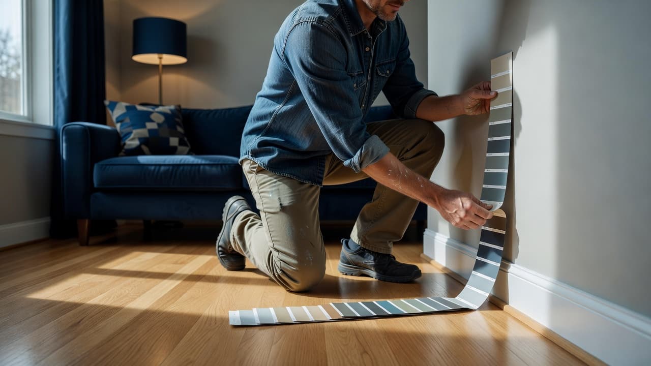
Use a simple process and give yourself time, as the proper attention to detail during the sampling phase will save you from costly mistakes later:
- Narrow your options to three or four colors that fit the undertones of your trim and flooring.
- Paint large poster boards or sample boards, at least 18 by 24 inches if you can. If you rent, tape the boards to the wall instead of painting directly.
- Place the samples next to the trim and near the floor, not on a random wall with nothing around it.
- Check them in morning light, afternoon light, evening light, and with lamps on.
A good sample test should answer practical questions. Does the color make the trim look brighter or dingier? Does the floor look warmer, cooler, redder, or grayer? Does the room feel calm, flat, heavy, or fresh? Before you start the main project, remember that essential prep work like caulking and sealing, as well as considering your ceiling painting requirements, will ensure that your final color choice looks its best once applied to the entire surface.
Don’t rush to pick the boldest option. In many rooms, the winner is the color that looks a little understated at first. Once it covers the full wall, that quieter color often feels more polished and easier to live with.
If you are deciding between white, greige, beige, and gray, samples usually settle the debate fast. White works when the room has enough warmth elsewhere, or when you want crisp contrast. Greige is the safest all-around bridge between warm and cool elements. Beige is often the best partner for warm wood and creamy trim. Gray can look clean and current, but only when the other surfaces support it.
Frequently Asked Questions
How do I identify the undertones in my flooring?
To identify undertones, hold a piece of plain white paper against your floor or trim. If the surface appears to have hints of yellow, red, or cream, it is warm; if it looks gray, blue, or ash, it is cool. Knowing this is the first step in choosing a wall color that complements your existing space.
Should I match my wall color exactly to my trim?
It is generally better to focus on coordination rather than an exact match. You want the undertones of your wall and trim to feel connected, but choosing a slightly different shade or color can prevent the room from feeling flat and helps define the architectural lines of your trim.
Is it necessary to test paint samples in different lights?
Absolutely, because your home’s unique natural light and artificial lighting will change how a color looks throughout the day. Testing large samples near your flooring and trim ensures the color remains consistent and avoids the common mistake of choosing a shade that only looks good on a small store chip.
Can dark flooring work with lighter wall colors?
Yes, pairing dark floors with lighter walls creates a classic, high-contrast look that makes a room feel crisp and intentional. Using a lighter wall color can also help ground a room and prevent the darker floors from making the space feel too heavy or closed in.
Conclusion
The best wall color choice starts with what is not changing. When you read the undertones in your trim and floors first, the paint decision gets clearer, faster, and much less stressful. A room does not need perfect matches. It needs consistency, enough warmth or coolness to connect the surfaces, and enough contrast to keep the space interesting.
Once your samples look right in daylight, beside the trim, and above the floor, you can move forward with confidence. If you feel ready for a fresh coat of paint but want expert results, our team of house painters Raleigh is here to help. As your trusted local painting company, we understand that quality prep work is the secret to a long-lasting finish. Whether you need residential painting services or are looking to boost your home curb appeal with our exterior painting services, we are ready to assist.
When you hire a professional painting contractor, you benefit from our commitment to detail and our ironclad workmanship warranty. We invite you to contact us for a free estimate to discuss your vision. If you are comparing painting estimates, reach out to our house painters Raleigh today to see how we can transform your space.