
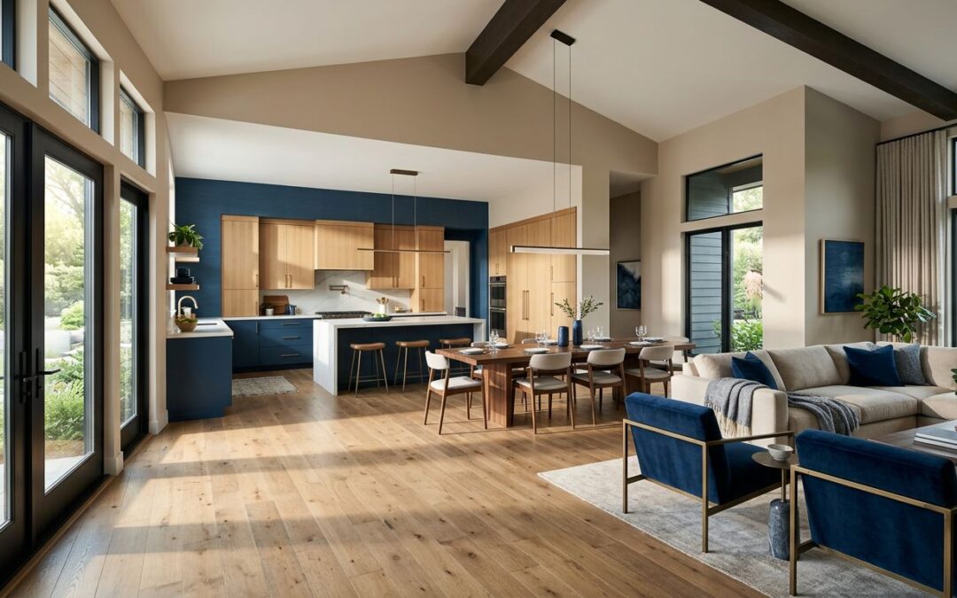
An open floor plan can feel bright, welcoming, and easy to live in. It can also make one wrong paint choice impossible to ignore. When your kitchen, dining room, and living room share the same view, open concept paint colors need to create a sense of connection without making the entire home feel flat or disjointed.
The right color plan considers daylight, flooring, cabinetry, ceiling height, and how each area is used. A thoughtful palette gives every space its own purpose while keeping the whole home feeling calm, cohesive, and polished.
Key Takeaways
- Choose one main wall color that works across the largest connected areas of your open floor plan.
- Check undertones before committing, especially with warm wood floors or gray tile.
- Use deeper colors on defined walls, built-ins, or ceilings rather than every wall.
- Test paint samples in morning, afternoon, and evening light before scheduling house painting.
- Coordinate walls, trim, cabinets, and ceilings as part of your overall strategy for using coordinated colors.
Start With One Unifying Color
The primary color is the foundation of an open floor plan home. It carries your eye through the room, connects separate functional areas, and gives furniture and finishes a consistent backdrop to your overall color palette.
For many Raleigh, Durham, Chapel Hill, and Wake Forest homes, a soft white, warm beige, muted greige, or gentle taupe is the safest place to start. These warm neutrals work well with changing North Carolina light, which can look cool in the morning and warmer by late afternoon.
A true bright white may sound simple, but it can feel stark beside warm hardwoods, cream tile, or honey-toned cabinets. Cool gray can create a clean look, yet it may appear blue or flat in rooms without much direct sunlight. The most successful neutral colors have enough warmth and depth to hold the room together.
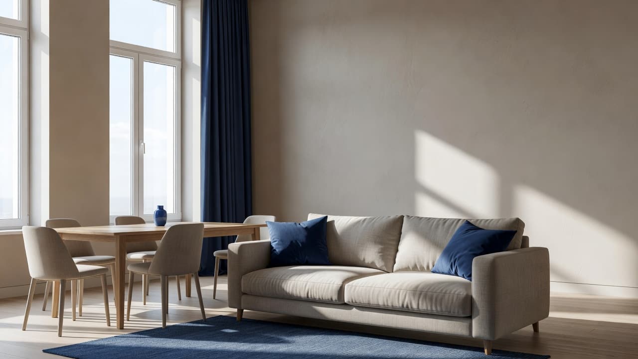
Consider these dependable directions for the main connected space:
- Warm off-white works well with wood floors, black hardware, and natural woven textures.
- Soft greige offers more depth than white and pairs easily with warm and cool finishes.
- Light taupe gives larger spaces a comfortable, grounded look without feeling dark.
- Muted sage or blue-green can bring in color while still acting like a neutral.
Complex neutrals often work better than plain beige or gray because they shift gently with the light. Brands like Benjamin Moore offer excellent guidance on how these balanced, layered neutrals serve as a strong choice for connected spaces.
A good main color should look comfortable in the kitchen, natural in the dining area, and restful beside the sofa.
Watch the Undertones in Floors, Counters, and Cabinets
Paint is never viewed alone. It sits beside the details you already own, including flooring, countertops, backsplash tile, fireplace stone, and cabinetry finishes. Those materials will either support the wall color or fight it every day. When you account for these fixed elements, you can create a truly cohesive space that feels intentional and balanced.
Look at the fixed surfaces first. Red oak floors often have orange or pink warmth. Many newer homes have gray luxury vinyl plank flooring with cool undertones. White quartz may lean crisp and blue, while cream quartz may have gold or beige veining. Paint should relate to those undertones instead of competing with them.
If your floors and cabinets are warm, choose a warm neutral with a soft yellow, beige, or rosy base. A cool gray paint can make warm cabinetry look more orange than it did before. If your home has cooler tile, blue-toned marble, or charcoal counters, a neutral with a subtle gray or green cast may feel more settled. You might look to brands like Sherwin-Williams to find specific variations of these neutrals that bridge the gap between your floors and walls.
The same attention matters when planning cabinet finishes. Fresh white cabinets can look clean against a creamy wall color, but the shades need to share a similar temperature. A blue-white cabinet color beside a yellow-white wall can make both surfaces look off.
Hold samples vertically against the wall, cabinets, flooring, and backsplash. Move them around the room. A color that looks perfect in the kitchen may shift dramatically near a stone fireplace or shaded dining nook.
Give Each Area Definition Without Breaking the Flow
Open concept design does not mean every wall must be painted the same color. It means the colors need a clear relationship. Think of the main wall color as the thread that ties the spaces together, while accent colors provide the details that give your home character.
A dining room feature wall, a living room fireplace surround that acts as a focal point, a kitchen island, or built-in bookcases can handle a deeper shade. Rich navy, soft charcoal, earthy olive, and muted terracotta all add interest when used with intention. These choices are perfect for creating moody interiors, especially when applied to architectural transitions or walls that already have a natural stopping point.
Color placement matters more than the number of colors. Painting a random wall dark can make the space feel disjointed. Instead, use color drenching or a dedicated accent wall to create a sense of purpose. Painting the wall behind a dining table or around a fireplace helps establish visual breaks that define zones without needing physical barriers.
A warm, rich neutral across the main space is also a strong option for homeowners who want more depth without adding visual clutter. These open-floor-plan color-drenching ideas show how one deeper wall color can create a cohesive, comfortable setting.
For a balanced plan, keep these relationships in mind:
- Use the same main wall color through the living room, dining room, and central hallway.
- Choose one supporting color for a feature wall, built-ins, or the kitchen island.
- Keep trim colors consistent across connected rooms.
- Repeat accent colors in pillows, art, rugs, or window treatments.
Ceilings also matter. A clean white ceiling can make the room feel taller and brighter. In a home with heavy beams or a lower ceiling, a soft ceiling color close to the wall shade can feel more finished. If popcorn removal is part of your update, the newly smooth ceiling gives you a clean surface that can brighten the entire room.
Use Light and Paint Sheen to Make Color Work Harder
Natural light changes paint color more than most homeowners expect. A wall near large west-facing windows may look warm and glowing in the afternoon, while the same paint can look muted or gray on the opposite side of the room. Because of this, lighting plays a vital role in how your color palette is perceived throughout the day.
Test samples in the largest shared area, not only on a small wall near a window. Paint poster boards or sample sections in at least two locations, and watch them in the morning, at midday, after sunset, and with your regular interior lighting on.
Light bulbs also change the result. Warm bulbs can make white paint appear creamier, while cooler bulbs may pull gray or blue tones forward. If you are replacing fixtures, choose your paint after you have selected the bulbs and major finishes.
Paint sheen has a similar effect on the look and durability of your space. Flat or matte paint hides small wall imperfections and gives living areas a soft finish. An eggshell finish is often a practical choice for connected living spaces because it offers a light, washable surface. For trim, doors, and other high-touch areas, a satin finish is a durable option that provides just enough luster to define the space.
A professional interior painting crew can help you compare samples on your actual walls and recommend the right finish for each surface. This avoids the common disappointment of choosing a color under harsh store lighting and seeing a different result once you are back home.
Make the Paint Plan Part of the Whole Home
A connected interior feels more complete when paint decisions extend beyond the main room. The entry, stairway, upstairs hall, and nearby powder room should feel related, even if they use slightly different colors. By establishing a cohesive color palette that carries through these transition spaces, you ensure the home feels intentional rather than disjointed.
This does not mean every room must match. Bedrooms, offices, and bathrooms can have more personality because they are separate spaces. The key is to repeat a familiar undertone, trim color, or accent shade so the home still feels unified.
A trusted Residential Painting Contractor can help organize the project around your style, schedule, and budget. Professional preparation also matters. Clean surfaces, repaired drywall, straight cut lines, and quality coatings are what give a well-chosen color its polished finish.
When you are planning Interior Painting, it can also be a good time to review Exterior Painting needs. A consistent approach to your home’s interior and exterior colors can strengthen curb appeal and help the property feel well cared for inside and out.
For Raleigh-area homeowners, working with a local Residential Painting Company brings practical value. Your painter understands regional light, common home styles, and the finishes that hold up well in busy households.
Frequently Asked Questions
Do I need to paint every room in an open floor plan the same color?
Not necessarily, but you should choose a primary, unifying color that flows through your largest connected spaces. You can create definition by using deeper accent colors on specific features like a fireplace surround, a kitchen island, or a dedicated feature wall.
How do undertones affect my paint color choice?
Your paint color will be viewed alongside fixed elements like wood floors, tile, and cabinetry, which all possess their own warm or cool undertones. If you choose a paint that clashes with these existing colors, the final result can look unintentional or discolored, so it is essential to test samples against your permanent finishes.
Why does my paint look different during the day?
Natural light changes throughout the day, shifting from cool morning light to warmer afternoon tones, which directly alters how paint pigments appear. Additionally, interior light bulbs can pull out hidden yellow or blue tints, which is why testing your samples at various times in multiple locations is crucial.
A Connected Home Starts With a Clear Color Plan
The best paint colors for an open floor plan are not always the lightest or most popular shades. They are colors that work in harmony with your floors, cabinetry, lighting, and daily routine.
Start with one dependable main color, such as one of the many versatile warm neutrals, check every undertone, and add contrast where the architecture gives it a purpose. With a clear plan and professional House Painting, your open space can feel bright, connected, and comfortably your own.