
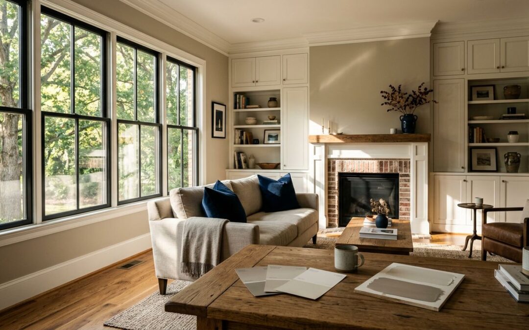
Paint can look perfect on a small chip, then feel completely different once it covers a living room wall. The interior paint colors Raleigh homeowners choose need to work with the home’s natural light, fixed finishes, and everyday life.
Raleigh homes often have bright daylight, mature trees, warm wood floors, and a mix of traditional and modern details. A color plan that looks polished in Cary, Durham, Chapel Hill, or Wake Forest starts with seeing how those elements work together.
Key Takeaways
- Raleigh’s natural light, leafy surroundings, flooring, trim, and fixed finishes can change how an interior paint color looks from room to room.
- Warm greiges, soft beiges, and gentle whites often work well with hardwood floors, brick, traditional details, and the natural warmth found in Triangle homes.
- Choose wall colors alongside cabinets, countertops, backsplashes, flooring, and trim so the full finish plan feels connected.
- Test large physical samples in morning, afternoon, and evening light before committing to a color or finish.
- A thoughtful residential painting plan should include preparation, finish selection, and coordination with cabinet painting or popcorn removal when needed.
Interior paint colors Raleigh homes need to handle real light
Natural light changes more than most homeowners expect. A north-facing room can pull cool and blue, while south-facing rooms may make warm undertones more visible. East-facing rooms change quickly between breakfast and late afternoon. West-facing spaces often become warmer toward evening.
Raleigh’s leafy neighborhoods add another factor. Green reflections from trees can soften a warm gray or make a pale neutral look slightly green, especially near large windows. That doesn’t make the color wrong. It means the color needs to be tested where it will live. To learn more about our Raleigh interior painters
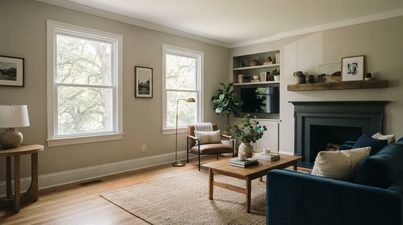
Start by considering the room’s exposure, window size, flooring, trim color, countertops, and major furnishings. Benjamin Moore’s color library helps compare neutral paint colors, including whites, beiges, greiges, and deeper accent shades. For physical sample boards or a second opinion, Spectrum Paint can help you compare those options in person before narrowing the field.
A flat or matte finish can soften wall imperfections, while eggshell adds a little durability and light reflection in busy rooms. The color stays the same, but the finish changes how much movement and brightness you notice as natural light shifts across the wall.
A sample is not a decision. It is a way to see the wall, floor, trim, and changing daylight working together before the room is painted.
Warm neutrals that work in Triangle homes
Neutral paint colors don’t have to feel gray, cold, or forgettable. The strongest choices have enough warmth to sit comfortably beside hardwood, brick fireplaces, creamy trim, and rich greens outside many Triangle homes. You don’t need to follow paint color trends blindly when those fixed materials already guide the palette.
Warm greige is often the safest middle ground. Greige paint has gray’s calm appearance with beige underneath, so it doesn’t feel sterile. Classic beige leans warmer and works well in homes with honey oak, travertine, or earthy stone. True gray can look clean and modern, but it needs more care in shaded rooms.
| Paint color | How it usually reads | A good place to use it | What to check first |
|---|---|---|---|
| Agreeable Gray | Soft warm greige | Open living areas and hallways | It may look more beige beside warm flooring |
| Benjamin Moore Revere Pewter | Mid-tone greige with depth | Historic rooms and dining rooms | It can feel darker with limited natural light |
| Accessible Beige | Balanced beige with a muted undertone | Bedrooms and homes with warm finishes | Pair it with a clean but not stark trim white |
| Repose Gray | Light gray with subtle warmth | Modern renovations and home offices | It may read cooler near blue-toned tile |
| Worldly Gray | Grounded warm gray | Family rooms and connected spaces | Test it beside cream cabinets and stone |
Choose among the neutral paint colors by looking at the fixed materials already in the house. Floors, tile, brick, cabinets, and countertops cost more to change than wall paint.
Agreeable Gray may suit one home but feel too warm in the next. Revere Pewter can add depth to a Downtown Raleigh bungalow, though it may overwhelm a small room. Accessible Beige suits warm finishes, while deeper accent colors can add focus to dining rooms or studies.
Compare Agreeable Gray with other contenders using Benjamin Moore guidance and Sherwin Williams resources (Sherwin-Williams color tools). Verify physical samples through Spectrum Paint before scheduling the project.
Soft whites that brighten without feeling harsh
White paint colors can make a home feel open, clean, and current, but pure white isn’t always best. Some neutral paint colors brighten a room without looking stark. In Raleigh’s natural light, bright white can look sharp against warm floors or feel cool and sterile after sunset.
Alabaster is a dependable soft white with warmth. It works well on walls, ceilings, and trim when you want a connected look without strong contrast. Pure White is cleaner and more neutral, making it a good choice for trim or a modern interior with balanced light.
Benjamin Moore White Dove has gentle warmth that works beautifully with traditional millwork, cream upholstery, and natural wood. Dover White is warmer still, making it better suited to homes with warm tile, beige stone, or golden flooring.
Choose your trim colors before committing to a wall shade. A wall color that feels balanced beside one trim shade may look dull or too cool beside another. Using the same white on walls and trim can also work well when finishes change, such as matte walls with satin trim. Alabaster can carry across walls and trim when you want a softer, connected look.
Match the color plan to your home’s character
Raleigh homes range from historic properties in Downtown Raleigh to newer neighborhoods in North Raleigh, along with renovated ranches, townhomes, and contemporary builds across the Triangle. Each style can support a distinct color plan without feeling disconnected from the area.
Older homes often look their best with warm whites, muted blue-greens, soft taupes, and classic greiges. These shades respect original trim, hardwood floors, and architectural details without making the home feel dated. A deep navy or charcoal can bring character as accent colors in a dining room, study, or powder room.
Modern renovations usually support cleaner whites, pale greiges, mushroom tones, and controlled contrast. A crisp white wall beside dark cabinetry can feel polished, while a soft beige can make an open-concept layout feel more comfortable and settled.
If cabinet painting is part of the project, select wall colors after viewing cabinet samples beside the countertop and backsplash. A creamy cabinet color may need a more neutral wall, while bright white cabinets often pair better with a shade that has a slight warm undertone.
Popcorn removal also changes the way a room feels. A smooth, freshly painted ceiling reflects daylight more evenly and can make existing wall colors look brighter. Plan the ceiling, walls, cabinetry, and trim as one connected finish plan.
Test paint samples before you commit
A color visualizer is useful for gathering ideas, but it can’t account for your exact lighting or finishes. Use it to narrow the palette, then test physical samples in the room. A sample that looks right at noon may look completely different under evening lamps.
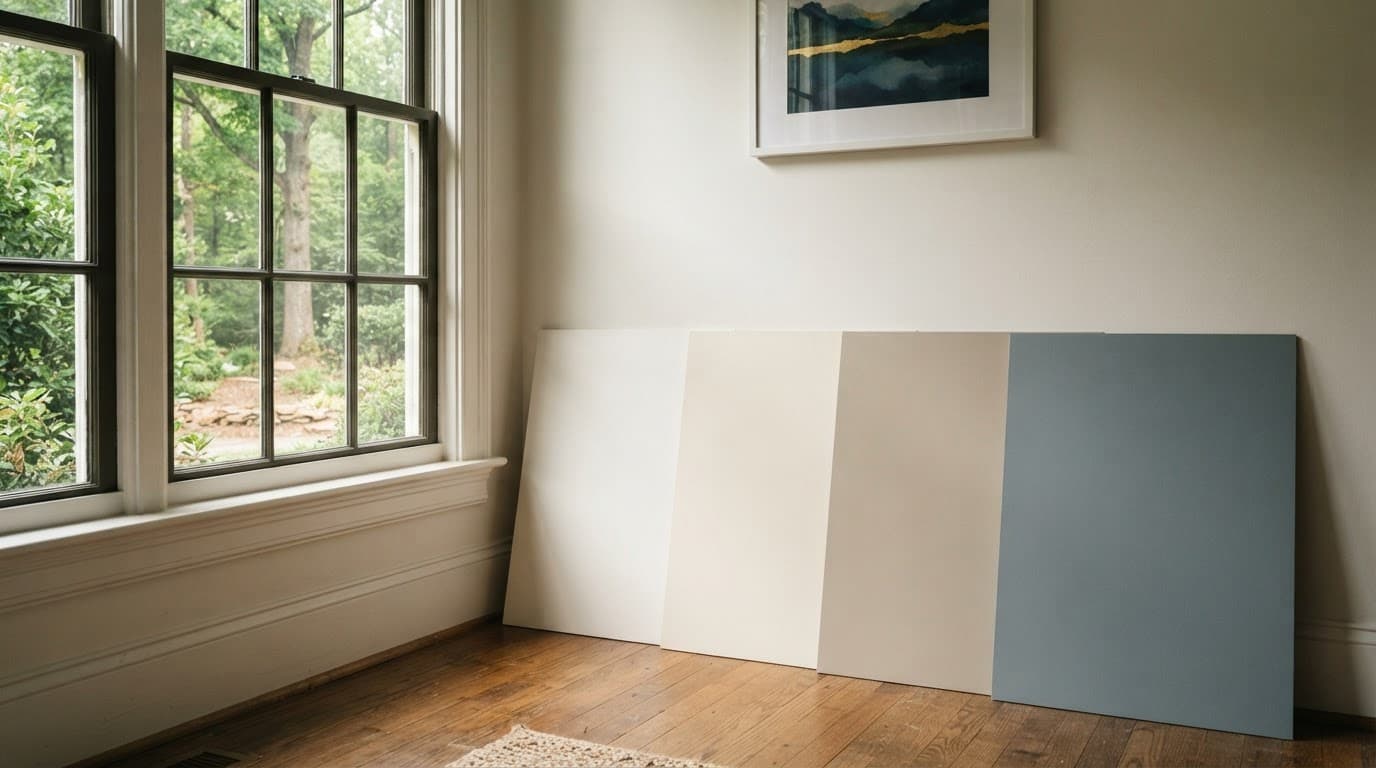
A clear color selection process keeps the decision simple:
- Paint two coats on large sample boards, then move them around the room instead of judging one wall only.
- Check each color in natural light during morning and afternoon, then at night with the lamps you use most.
- Hold samples beside flooring, countertops, tile, drapes, and upholstered furniture.
- Review the color from the doorway and across the room. A shade that looks good close up still needs to feel right at a distance.
For local sourcing, Sherwin Williams Raleigh paint store can help with samples, finishes, and paint supplies. Spectrum Paint is another local option for physical sample boards. Benjamin Moore products are also available through Town & Country Hardware on Creedmoor Road. Call Spectrum Paint ahead if you need a particular product line or a larger quantity for a full project.
Keep interior and exterior decisions connected, but separate
Interior painting, cabinet painting, and popcorn removal are often planned together because they affect the same rooms and schedule. A residential painting contractor can help you choose the order of work, protect floors and furniture, repair walls, and keep the finish consistent across the home. Before scheduling, confirm product availability and lead times with Spectrum Paint.
Exterior painting should follow its own color plan. Raleigh’s humidity, rain, summer heat, and red clay require durable coatings and practical choices at ground level. A bright white that looks beautiful on an interior ceiling may show every splash near an exterior foundation. Local exterior paint guidance for Raleigh homes can help you compare options for brick, siding, trim, and foundations.
A residential painting company should ask about your home’s condition, preferred schedule, existing finishes, and long-term goals. Quality house painting starts with preparation, clear guidance, and a finish that still looks good after the furniture is back in place.
Frequently Asked Questions
What interior paint colors work best in Raleigh homes?
Warm greiges, soft beiges, and gentle whites are dependable choices for many Raleigh homes. The best option still depends on natural light, flooring, trim, cabinets, and other fixed finishes.
How does Raleigh’s natural light affect paint colors?
North-facing rooms can make colors look cooler, while south- and west-facing rooms often emphasize warm undertones. Green reflections from mature trees can also make pale neutrals appear slightly greener near large windows.
Should I choose the wall color or trim color first?
Choose or confirm the trim color before finalizing the wall shade because the two colors affect how each other appears. Using the same white on walls and trim can create a softer, more connected look when the finishes are different.
How should I test paint samples before painting?
Paint two coats on large sample boards and move them around the room to check them beside flooring, countertops, tile, furniture, and drapes. Review the samples in morning and afternoon daylight, then again at night with the lamps you use most.
Can interior painting be combined with cabinet painting or popcorn removal?
Yes, these projects are often coordinated because they affect the same rooms and schedule. Plan the ceiling, walls, cabinetry, and trim together, and confirm the order of work with a residential painting contractor.
A Color Plan That Feels Like Home
The best color is not the one that looks best under store lighting. It is the one that feels balanced in your Raleigh home as natural light shifts from bright mornings to shaded afternoons and quiet evenings.
Test a few strong options, trust the fixed finishes already in your home, and give each room the time it needs. A thoughtful color plan creates a clean, comfortable, lasting finish that feels right every day.
Ready to update your home with a fresh new color? Paint & Co. provides professional interior painting services throughout the Raleigh area. Click here to learn more about our process and to request a free interior painting estimate.